Some pieces were designed at a time when single Pantone colour printing was cheaper than full colour printing. Some print runs were too small to make commercial off-set printing economical, so were produced using a photocopier.
Limited colour/low budget design


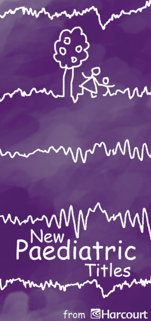
Multi-page, saddle-stitched booklet. Printed in a single Pantone colour. Cover only depicted.
The cover combines several elements in an original illustration: EEG traces, childlike drawing, blackboard chalk lines and duster marks. The brochure title was rendered in Comic Sans due to the subject material. One of the few times use of comic sans is justified 😉.


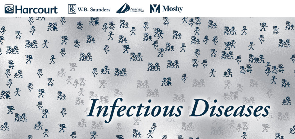
I illustrated the concept using pictograms of different shades to infer spread of disease between individuals and groups. The lighter shading is also clustered around the title to show the idea of a source.


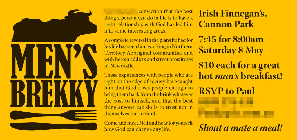
The required print run for this flyer was low (less than 300), time was short, and the in-house copier was B&W only. So I opted for a typographically oriented design in black, printed on coloured paper.
Yellow was picked for the paper to reflect the food/breakfast element, and to be eyecatching. It also shows off the blank printing to good effect.
A stock vector was used for the bull, and cutlery was drawn in Illustrator.