Willows Presbyterian Church
The client is a Presbyterian church. The design sought to avoid cliched symbols and reflect a church congregation with a diverse range of ages, and reformed theology.
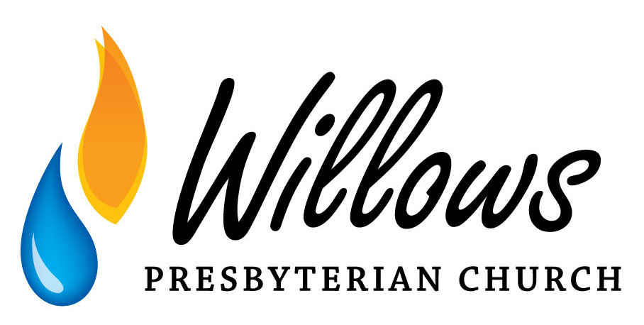
The symbols used are drawn from a bible verse which speaks of people needing to be born again of spirit and water. This correlates to an effective definition of who is a Christian, and by extension who makes up a church.
The logo was designed in horizontal and vertical formats, with versions for small appearances, monochrome, and reversal.