Summit Ridge Wilderness Experiences
The client was a start-up business aiming to provide outdoor adventure experiences.
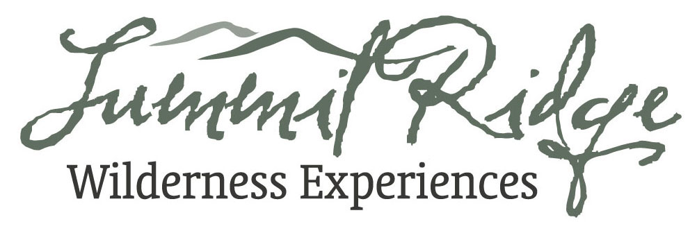
The logo uses a rough, calligraphic typeface to reflect the outdoor adventure nature of the business, with a modified ‘t’ and and extra element to connote a geographic ridge line. The additional element is also render in a lighter colour to show the idea of aerial or atmospheric perspective as hills fade into the distance.
Horizontal, vertical formats were designed in full colour and monochrome verisons. Small size and initials-only versions were also designed.